The term “Web 2.0 ” is commonly associated with web applications that facilitate interactive information sharing, interoperability and user-centered design. The Web 2.0 is a technology used to built web applications which are more interactive and to share valuable information. You may be wondering why we are discussing on web 2.0 technology? This is just to give an idea about what Web 2.0 is.
Similar to the interactiveness of web applications built using web 2.0, dashboard feature in NetFlow Analyzer are more interactive and user centered. In this topic we are going to discuss on Dashboard feature available in NetFlow Analyzer.
Default Dashboard:
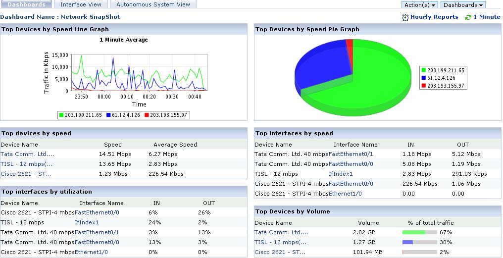
The Network Snapshot is the default dashboard for all users in NetFlow Analyzer. The time period for which the report is shown can be modified using the Select Period . The time period chosen could be one of – Last Hour, Last 6 Hours, Today and Last 24 Hours.
It displays details categorized under the following heads.
1. Top Devices by Speed
2. Top Interfaces by Speed
3. Top Interfaces by Utilization
4. Top IP Groups by Speed
5. Top IP Groups by Utilization
The user can also set page refresh time for the dashboards, so that the page will be refreshed based on the user selection and get you more closer to real time stats.
Customizable Dashboard:
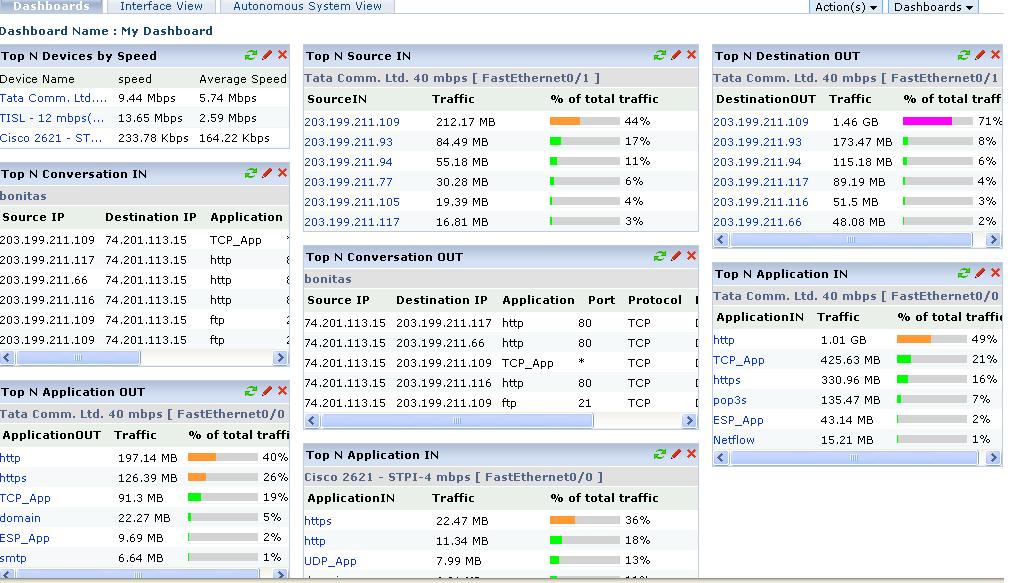
You can also customize and create dashboards as per your requirements. To create a new dashboard, click on “Actions” on the top right and from the drop down, select “new dashboard”. You can assign a name for every dashboard you create, and start assigning widgets for the new dashboards. As of now it is only the users with the administrator credentials that can create, edit and view custom dashboards. The guest and operator users can only view the product’s default dashboard which is the network snapshot view.
When creating dashboards and selecting the widgets for it, NetFlow Analyzer provides more than 50 unique widgets for your dashboard, thus helping you have almost every report in the dashboard with near real time updates. You can even set your favorite dashboard as the default one to load when you log on to the product.
Quite a lot for a simple feature? We follow what NetFlow Analyzer provides as a whole for each of our features too. Quite a lot in a simple looking, easy to understand user-interface.
Demo | Download 30-day Trial | Twitter | Customers
Regards
Praveen Kumar


Hi,
Currently the dashboard with traffic widgets shows data in 1 minute average, it is not possible to generate traffic graph on the dashboard with 15 or 30 min average. We will add this feature to our road map and will be available based on market demand.
Hi,
I like the dashboard flexibility but i’m looking to build a dashboard with 15-min graphs for only specific sites and not only “top n” tables..
How and where do i find those widgets ?
Kind regards,
Marc